Your home’s exterior color isn’t just a personal preference — it’s a conversation between paint and architecture. The siding material and color you choose either amplify your home’s story or work against it. Whether you’re restoring a Victorian to its former glory or putting a fresh spin on a mid-century ranch, understanding the relationship between architectural style and color palette is the key to a result that feels intentional, not accidental.
Here’s your style-by-style guide to getting it right.
Victorian & Queen Anne (1860s–1910s)
Victorian homes are the showboats of residential architecture — and their color schemes should be too. These elaborate structures, with their ornate trim, decorative brackets, bay windows, and wraparound porches, were historically painted in what’s known as a “painted lady” palette: three to five coordinated colors that highlight every architectural detail. If you’re installing new siding on a Victorian, fiber cement is a popular choice — it holds paint beautifully and can be milled to replicate the intricate profiles of the era.
What works:
- Body: Earthy mid-tones — sage green, dusty plum, warm ochre, or slate blue
- Trim: A lighter or contrasting shade to make the woodwork pop
- Accent: A bold third or fourth color for doors, shutters, and decorative gingerbread
What to avoid: Monochromatic schemes. A single color flattens the intricate details that make Victorian homes worth admiring in the first place.
Pro tip: The San Francisco Painted Ladies are the gold standard here. When in doubt, look to historic preservation color guides from brands like Sherwin-Williams or Farrow & Ball, which offer period-accurate palettes.
Craftsman & Bungalow (1905–1930s)
Craftsman homes celebrate honesty in materials — natural wood, exposed rafters, stone foundations, and wide front porches that invite community. The color palette should reflect that earthy, handmade philosophy. Engineered wood siding is a natural fit here, offering the warmth and grain of real wood with far greater durability and resistance to moisture and pests.
What works:
- Body: Deep, nature-inspired tones — forest green, warm brown, olive, terracotta, or rust
- Trim: Cream, tan, or a slightly lighter version of the body color
- Accents: Rich jewel tones (deep teal, burgundy, hunter green) for the front door
What to avoid: Bright whites and cold grays, which feel at odds with the warm, organic character of the style.
Pro tip: Let the materials lead. If your home has a stone foundation or exposed brick, pull a color from those natural elements and build your siding palette outward.
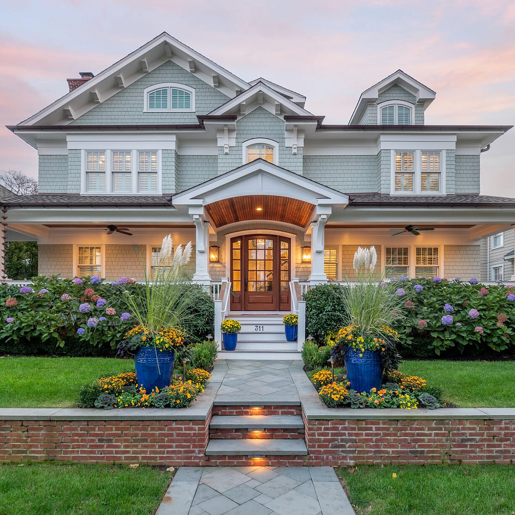
Colonial Revival (1880s–1950s)
Colonial homes are defined by their symmetry, formality, and restraint. The color palette should mirror those values: classic, clean, and dignified. Clapboard or lap siding — whether wood, fiber cement, or vinyl — is the traditional choice for this style, and its horizontal lines suit the clean, orderly façade perfectly.
What works:
- Body: Crisp white, soft cream, pale gray, or muted navy
- Trim: Bright white or black for sharp contrast
- Accents: Black, deep red, or forest green shutters and doors
What to avoid: Trendy or unconventional colors. A Colonial in blush pink or lavender misses the mark entirely.
Pro tip: The black-and-white combination is nearly foolproof for Colonial architecture and has remained stylish for over a century. A glossy black front door with brass hardware is a timeless finishing touch.
Mid-Century Modern (1945–1970s)
Mid-century modern homes were designed to blur the boundary between indoors and outdoors, with flat planes, large windows, and an integration with the surrounding landscape. The color palette should honor that dialogue with nature. Smooth, flat-panel siding — whether fiber cement, stucco, or composite — complements the clean geometry of these homes far better than traditional lap profiles.
What works:
- Body: Warm neutrals (sand, taupe, warm white), earthy oranges, avocado greens, or charcoal
- Trim: Minimal — often the same color as the body, or a subtle contrast
- Accents: A single bold color (burnt orange, turquoise, mustard yellow) used sparingly on the front door or accent wall
What to avoid: Traditional or Victorian-era palettes. Ornate, multi-color schemes fight the clean lines that define the style.
Pro tip: Mid-century modern homes look stunning when the siding color connects visually to the landscape — think warm desert tones in dry climates or cool grays and greens in wooded settings.
Tudor Revival (1890s–1940s)
With their steeply pitched roofs, half-timbering, decorative stonework, and asymmetrical façades, Tudor homes already have tremendous visual character. The paint palette should complement — not compete with — these dramatic features. In many cases, the stucco panels between timber framing are the primary “siding” surface, and keeping them in a clean, light tone is essential to the style.
What works:
- Body: White, cream, or pale stucco between the dark timber framing
- Timber accents: Deep brown, dark walnut, or near-black
- Doors: Rich, saturated colors — burgundy, deep teal, forest green — for a pop of personality
What to avoid: Light or pastel tones on the timber framing, which dilute the bold contrast that makes Tudor architecture so striking.
Pro tip: The contrast between the white stucco and dark timber is the defining feature. Protect it. Everything else is secondary.
Cape Cod & Coastal Cottage (1600s–present)
Cape Cod homes are about simplicity, coziness, and a connection to the natural landscape — often a seaside or rural setting. The color palette should feel effortless and weather-worn in the best possible way. Natural cedar shingle siding is the iconic choice here, though fiber cement shingles offer a lower-maintenance alternative that holds up especially well in coastal environments where salt air and humidity take a toll.
What works:
- Body: Classic white, soft gray, or weathered shingles (often left to silver naturally)
- Trim: Crisp white
- Accents: Navy, deep red, or sage green shutters; a cheerful front door in yellow, red, or soft blue
What to avoid: High-contrast, urban palettes that feel out of place against a natural setting.
Pro tip: Natural cedar shingles that are left untreated will weather to a beautiful silver-gray over time — one of the most iconic looks in American residential architecture. If you love the look but want less upkeep, pre-finished fiber cement shingles can replicate it with a fraction of the maintenance.
Spanish Colonial & Mediterranean Revival (1915–1940s)
These sun-soaked styles — characterized by stucco siding, terracotta tile roofs, arched doorways, and wrought iron details — call for a palette that evokes warmth, light, and the Mediterranean landscape. Stucco is both the traditional and most appropriate siding material here, and its natural texture holds color in a way that feels authentic to the style.
What works:
- Body: Warm white, creamy off-white, sandy beige, or soft terracotta
- Accents: Deep indigo, cobalt blue, or Moorish tile-inspired greens for the door or window trim
- Roof tiles: Warm terracotta (often non-negotiable if original tiles remain)
What to avoid: Cool grays, blue-toned whites, or anything that reads as cold or northern European.
Pro tip: The contrast between warm stucco walls and deep-toned wrought iron or wooden accents is essential to the style. Don’t shy away from saturated accent colors — they’re authentic.
Contemporary & Modern (1990s–present)
Contemporary homes offer the most freedom — but also the most room for error. The clean lines, mixed materials, and geometric forms of modern architecture work best with a palette that’s confident and intentional. Mixed siding profiles — such as horizontal fiber cement panels combined with vertical wood or composite accents — are a hallmark of the style and create natural opportunities for two-tone color strategies.
What works:
- Body: Charcoal, warm black, deep navy, concrete gray, or warm white
- Accents: Natural wood siding panels, raw steel, or a single bold color used as a statement element
- Contrast: Black window frames against white or light gray siding
What to avoid: Fussy or traditional palettes that clash with the architectural language.
Pro tip: Less is more. A two-tone scheme — such as charcoal fiber cement paired with warm wood-look panels — is often more impactful than a complex multi-color approach.
Universal Rules Worth Remembering
Regardless of your home’s architectural style, a few principles apply across the board:
- Test your colors in natural light. Paint large swatches (at least 12″ × 12″) and observe them at different times of day. Colors shift dramatically from morning to dusk. Many siding manufacturers also offer sample boards for exactly this purpose.
- Consider the fixed elements. Roof color, stone, brick, and hardscaping can’t be changed easily. Build your siding color palette around them.
- Look at the neighbors — but don’t match them. You want your home to complement the streetscape without disappearing into it.
- Think about resale. Bold personal choices can be wonderful to live with and challenging to sell. If you’re planning to move within five years, lean toward broader-appeal palettes.
- Don’t neglect the finish. The sheen of your siding finish matters as much as the color. Flat finishes hide imperfections; satin and semi-gloss are more durable and easier to clean. Most trim benefits from a higher sheen than the body siding.
The Bottom Line
The best exterior color schemes feel inevitable — as though the house couldn’t be any other color. That feeling comes from working with the architecture rather than against it. When you understand your home’s style, its history, and the siding and color traditions that grew up around it, you gain a framework that makes the whole process far less daunting.
If you’re planning a siding project and want guidance on which materials and colors are the best fit for your home’s architecture, our team is here to help. We work with homeowners every day to make sure the finished product doesn’t just look great on day one — it looks right for years to come.
The rules exist for a reason. But once you know them, you’ll also know exactly where — and when — you have room to break them.